Most of what I did was a coverage test over the new Corax White brush-on paint (which is actually a light gray, so be aware of that). This is because I wanted to evaluate what they actually look like in person rather than on a computer screen or what the label strips on the paint rack indicate. This is really important if you're aiming for a very specific color tone , which is the case here. I was evaluating whether Blood Angels Red (a contrast color) or Word Bearers Red (one of the formerly Forge World exclusive paints) would look better for the metallic candy apple red I want to use for my Heresy-era Thousand Sons. Turns out that Blood Angels Red is more of the intense red I want and Word Bearers Red is more like dried blood stains. Using Blood Angels Red will save me a step anyway as I would have to otherwise shade all the recesses with Nuln Oil.
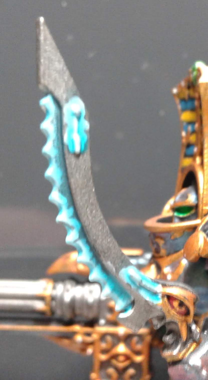 |
| Cracklin' power sword |
The next Thousand Sons model to work on will be the Scarab Occult Sorcerer. Since contrast paints lend themselves very well to wet blending due to their long drying time, I'd planned to use them to paint the weird flame thing that is a part of the staff's head. This is where seeing them for myself comes in; I was not entirely sure which of the purplesque colors would work to blend with Aethermatic Blue. I tested Magos Purple and Volupus Pink to see what they were like in-person. Magos Purple turns out a rather faded purple, which would be awesome if I was painting up a Hive Fleet Leviathan army for Tyranids. But it's not enough on the pink side to really fit well with the distinct Tzeentch look. Volupus Pink, on the other hand, was exactly what I was looking for. Definitely going to use that color when I get around to painting the Pink Horrors in my Silver Tower set.
I also did some tests on other Contrast paints and I'd like to share some thoughts.
 |
| Sometimes extra thick. |
Secondly, do not let these paints pool in weird places on your models. They are just thick enough that you'll lose fine detail if you let pools lie. My advice is to apply them to the details/recesses first, then go over the other areas with less paint on your brush.
My third thought is that these will not replace traditional techniques if you want your models to look good rather than tabletop quality. If all you want is a tabletop quality paint job, then the contrast paints will do just fine. But if you're aiming higher, contrast paints supplement rather than supplant existing techniques.
Lastly, I think they'll be a good gateway into some advanced techniques. Most of the professional level painters I know (the ones that get commissioned by the companies that make the miniatures) will use white (or off-white) primer as a starting point. This is because you have absolute control and responsibility over the colors if you start with white. This means color intensity, shading, and color values are all things a painter starting with a white/near-white model have to consider when painting it. Since contrast paints work best over lighter colors, I think they functionally serve as an introduction into the aforementioned mode of thinking.
No comments:
Post a Comment