Some of these have been featured before, back in a catchup post in January 2019, but some of these deserve commentary.
 |
| Astrea Solbright |
Because my pet Stormcast army is called the Thunderborn, I felt that Astrea's dracoline needed something that had the colors of clouds. Fortunately the region I live in has lots of clouds and lots of rain, so I have a lot of references to draw from. I ended up taking some colors from stormy clouds around sunset. The base color for the dracoline skin was Nightmare Black (Reaper). Then I believe I worked in The Fang (Citadel) as the main skin tone, leaving the Nightmare Black for creases. After that I highlighted with Warpfiend Grey (Citadel). But since this was too stark of a contrast from The Fang, I ended up blending the two colors in varying amounts and adding a lot more subtle transitions. This also let me get in some more subtle highlights on areas where light wouldn't necessarily hit directly. The scales were a pretty easy decision; mimic the look of a clear blue sky peeking out from the clouds.
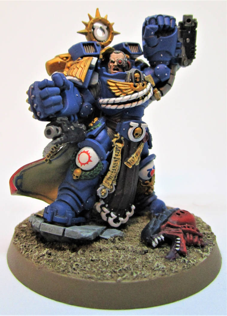 |
| Marneus Calgar (2018) |
I am happy however, that my current painting process for Ultramarines scales nicely to the fancier models that have all that bling of war (as another friend has called it). To quote Marie Kondo: "This one sparks joy.", whereas the old paint scheme did not. It was complicated enough that painting a whole squad of ten models done was going to be painful, let alone an army built to play Horus Heresy games. Because of the newer and less intensive color scheme, I've gotten a few other Intercessors done for my Ultramarines, which I'm going to use with the thing that lets them be Veteran Primaris. I've only got three left to paint in the squad, which is an accomplishment for me. They'll turn up in a comic shortly.
On the weirder side, I had a can of spray primer do something that I'd never seen before. The paint came out and started foaming on the models. So the entire HQ section I had for my Ultramarines and a bunch of Intercessors had to get stripped clean. The new Abaddon's base was caught in that fiasco too. I am very glad that I kept the model separate from its base because cleaning that stuff off a model with as much detail as the 2019 Abaddon would have been nightmarish.
I've mentioned this before but I'm not working on any projects that extensively use Games Workshop's new contrast paints. But I have been using them. If you've seen the Warhammer Community post where Tyler Mengel talks about how he used contrast paints, you'll notice he uses the Contrast Medium (Citadel) extensively. After using contrast paints on a cape, I believe I understand why. Using the medium with the contrast paints gives you back a measure of control and reduces issues associated with pooling. Now, mind you I got a very good result on the cape, but I had to clean up extensively with regular paints to reduce the blotchy look. I also forgot a very basic rule about painting white and that is to start with a gray, so the white part of the cape is not as nice as I'd prefer but it works. The red interior of said cape needed a nice coat of Wraithbone (Citadel, brush-on), so I suppose I could have saved myself a lot of time by just painting red over the black primer, but the Blood Angels Red (Citadel) went very nicely over it. This project will probably get more commentary in a few weeks as I have a contest entry to work on.
No comments:
Post a Comment